POP BRAND SHIFT
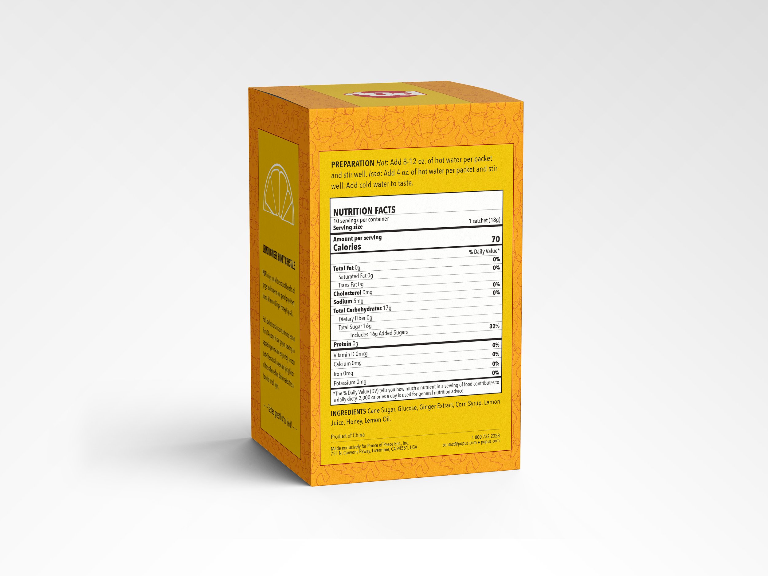
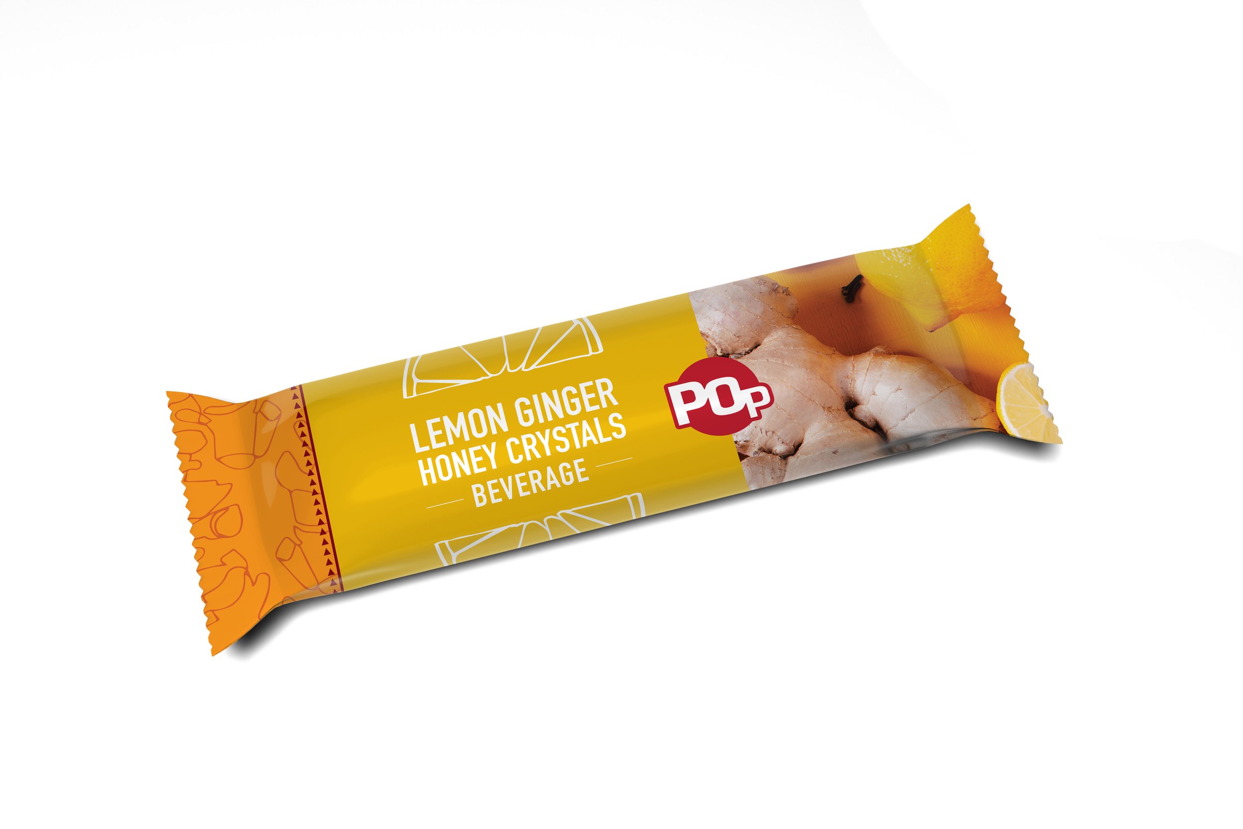
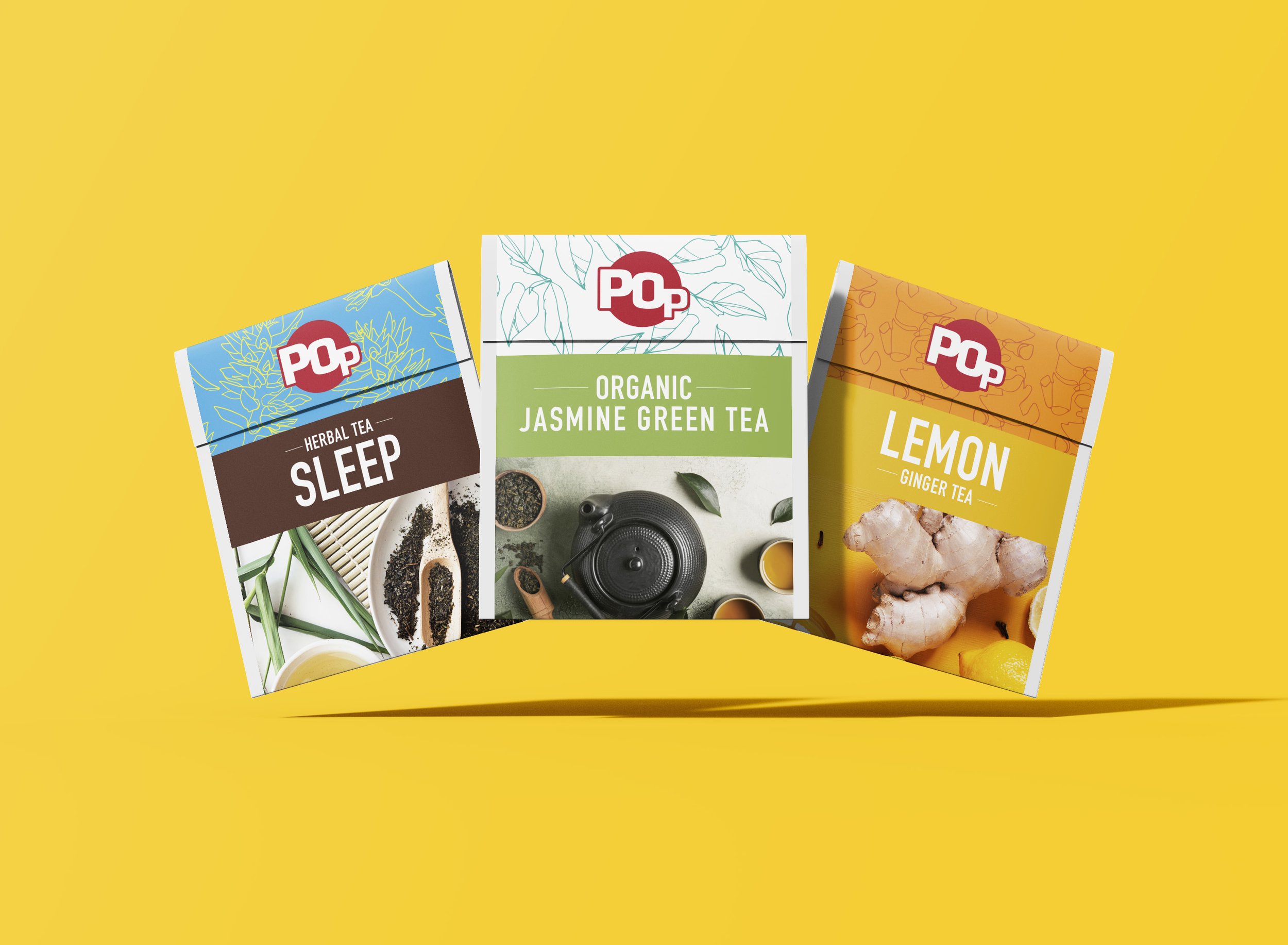
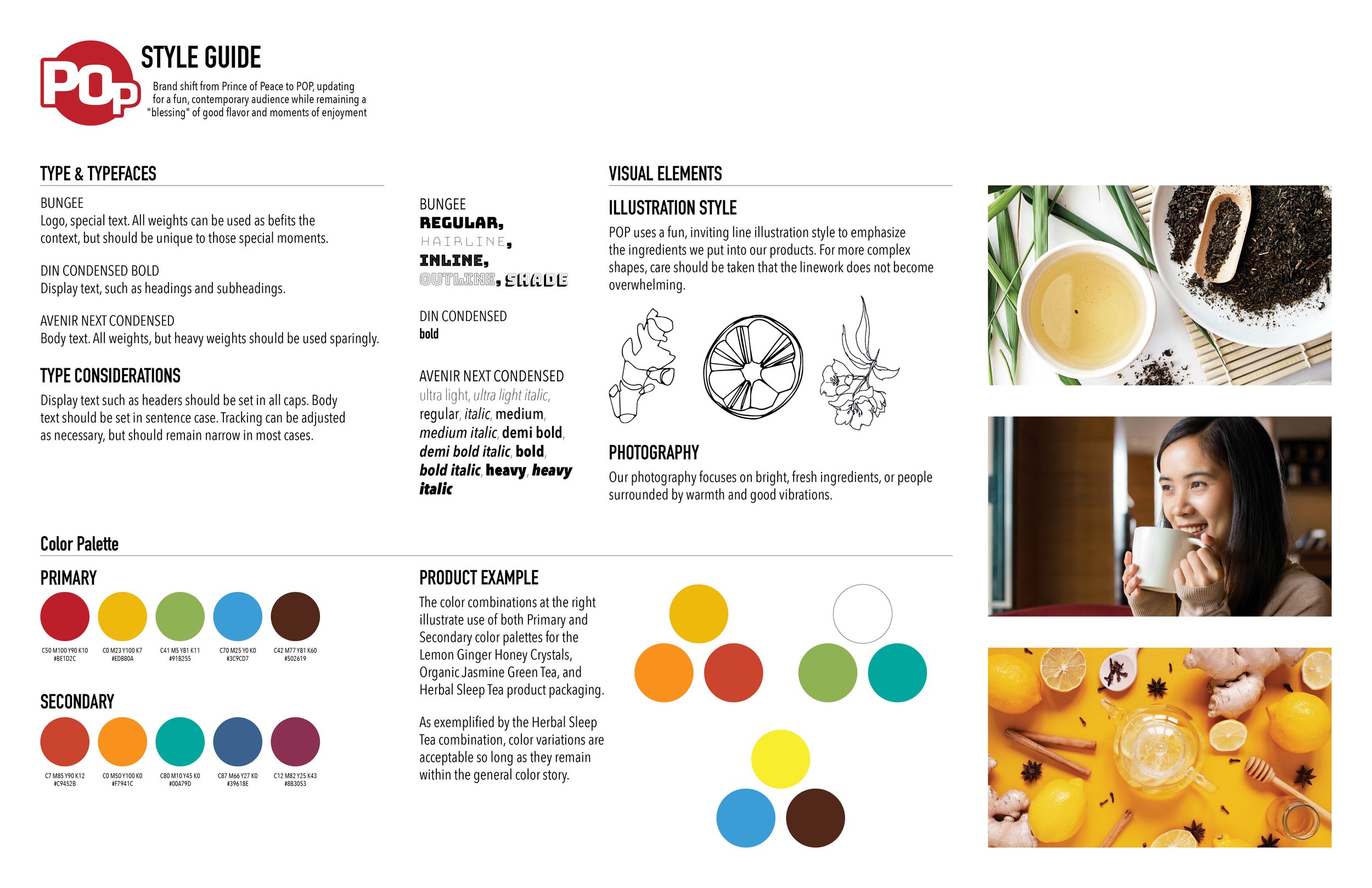
This brand shift re-imagines Prince of Peace as POP, updating its image with bright colors, delightful illustration, and good vibrations for a contemporary audience. One item from three categories of beverage products, a single-page website, and a style guide were chosen for redesign.


WEBSITE
STYLE GUIDE

THE BRIEF
With a wide range of packaging designs across a variety of Prince of Peace products, this brand shift aimed to bring in consistency to the Lemon Ginger Honey Crystals, Organic Jasmine Green Tea, and Herbal Sleeping Tea items, in addition to a new, contemporary look.


